Cognitive psychologist Richard Mayer has made it his life’s work to understand how technology – such as multimedia—can support and enhance learning. His ongoing experimentation has uncovered a number of principles useful to those developing asynchronous and synchronous online instruction. The findings are useful as well to those creating participant guides and job aids, and to those involved in technical writing tasks.
Here is an overview of just three of the principles of multimedia learning, with more to come in a future column.
Contiguity
Contiguity Principle: Present corresponding words and pictures contiguously; place text near, or insert into, images.
Consider Figure 1. The learner simply has to work too hard to match items in the image on the right with the legend at left. The layout is neat, and the image is “pretty,” but understanding requires enormous work for the learner who will have to struggle mightily to hold separate items in his or her working memory. Consider: the learner’s eyes must jump from one side of the screen to the other, all the while trying to decipher the meaning of “terracette.”

Figure 1: This figure violates the contiguity principle by separating text and image, creating more work for the learner.
Solution: Whenever possible, integrate text within the image, or at least put it as close as possible. Figure 2 does this and is much clearer.

Figure 2: By integrating the text within (or close to) the image, this example makes it easier for learners to understand the explanation.
Note: This Contiguity Principle applies to print materials as well as to screens in online instruction. Don’t forget this when using images in participant guides, workbooks, or job aids.
Multiple representation principle
Multiple Representation Principle: Presenting words and pictures is more effective than presenting words alone.
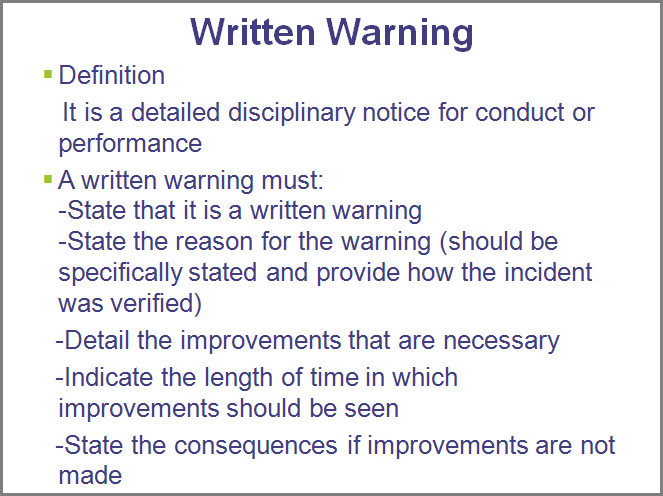
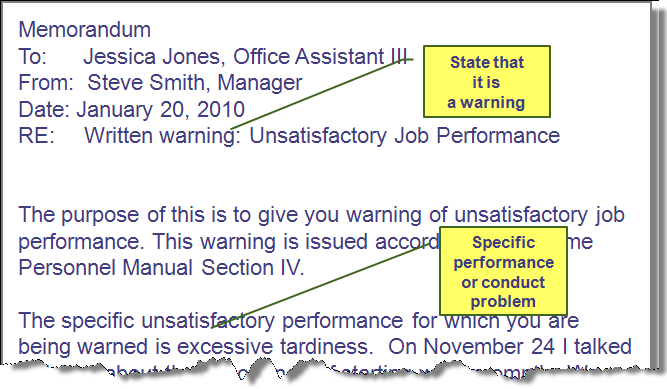
Words + (meaningful) pictures together are better than words alone. You’d think this one would be evident by now, but I see instance after instance in which the sheer volume of text manages to completely obscure the meaning. Compare Figure 3 to Figure 4.

Figure 3: Presenting words alone does not help the learner understand what they must do.

Figure 4: By embedding the text in the image of an actual letter, the designer helps the learner understand what is to be done.
Figure 4 is also all text, but the text is offered as an image of an actual letter – the document at issue – with important information highlighted by callouts. Note, too, that Figure 4 mimics real-world performance. The manager does not need to memorize the elements of a warning letter in order to rattle them off on demand, but should include them in a letter that will look much like this one. Since the performance is not memory-dependent, this is also (or instead) a useful printable takeaway and future-reference tool.
Split attention principle
Split Attention Principle: When offering auditory information, do not replicate it with onscreen text. In other words: Do. Not. Read. Screens. Aloud.
Instructional designers tell me they fight this battle all the time, with clients who insist on word-for-word narration even though it will hurt the learning. Basically, we read and hear at different speeds, so managing both onscreen text and matching narration just overloads the learner by splitting his or her attention.
Voiceover on Figure 3? Never.
A voiceover explanation of Figure 4? Better – as long as you’re not just reading the warning letter verbatim.
- Note: “I like narration with the text” is not a reason.
- Note: “Adding text to the narration supports auditory and visual learning styles.” No, it confuses everyone, and bores me, and besides, there is no evidence to support the notion that catering to “learning styles” does anything to support learning anyway.
- Note: Text written with PowerPoint Word Art tools is still text. Text zooming and flying and fading is still text, made worse by the animations.
The most obvious solution here? Why, get rid of the text. And if taking away the text leaves nothing, well, then that’s a Word document. E-mail it to everyone, or load it to Google Docs and tell them how to get to it.
In working to develop effective instruction, those with an eye for design are sometimes distracted by what is pleasing. Clients can be distracted by what they think is good, or what they’ve seen elsewhere (never mind that it actually harmed learning), or what they heard at a trade show, or what they perceive as “cool.” (For fun, check out anecdotes on the “Clients From Hell” Website: http://clientsfromhell.tumblr.com .) Brush up on your Mayer to help support your credibility as a professional using research-rooted, evidence-based, data-driven practice.
For more details on these and additional research-based principles of multimedia learning, see Mayer and Mayer & Moreno, as well as work from Ruth Clark and John Sweller in the Resources list.
Resources
Clark, R. & Mayer, R. (2009) E-Learning and the Science of Instruction. San Francisco: Pfeiffer.
Clark, R., Nguyen, F., & Sweller, J. (2006) Efficiency in Learning: Evidence-Based Guidelines to Manage Cognitive Load. San Francisco: Pfeiffer
Mayer, R. & Moreno, R. (1998). "A Cognitive Theory of Multimedia Learning: Implications for Design Principles." http://www.unm.edu/~moreno/PDFS/chi.pdf.
Moreno, R., & Mayer, R. (1999). "Cognitive principles of multimedia learning: The role of modality and contiguity." Journal of Educational Psychology 91: 358–368. doi:10.1037/0022-0663.91.2.358.
Mayer, R. E. (2001). Multimedia learning. New York: Cambridge University Press.
ISBN 0-52178-749-1.
Sweller, J. & Chandler, P. (1994). Why some material is difficult to learn. Cognition and Instruction 12: 185-233.
Figures 1 and 2 from
Bozarth, J. (2008). Better than Bullet Points: Creating Engaging e-Learning with PowerPoint. San Francisco: Pfeiffer. Original “river studies” images by Debbie Milton.


